Flight application

UX design | Application design

My role

UX designer

Tools used

Adobe XD
Project overview

This project was part of my UX degree in 2020 and aimed to familiarize myself with the principles of UX design, including the tools and their application. We were tasked with creating an airline application for either web or mobile, and I chose mobile, recognizing its importance for airlines.

Through usability testing of existing airline applications and drawing inspiration from industry leaders, I developed a clickable prototype for a flight booking application.

My contributions
  • Research and benchmarking
  • Usability testing
  • Affinity diagram
  • Customer journey mapping
  • User flow creation
  • Wireframing
  • Prototyping
Usability testing

To initiate the project, I conducted usability tests on the Norwegian and Ryanair applications with two participants from diverse backgrounds. This helped me pinpoint areas for improvement and identify successful features to incorporate into my design.

Affinity diagram

Based on the feedback I received from the usability tests, I organized my findings using an affinity diagram. I categorized the insights into specific application screens and grouped them into themes such as "Suggestions," "Positives," and "Pain Points." This structured approach allowed me to clearly visualize user feedback, making it easier to identify trends and priority areas for improvement. By synthesizing the data in this manner, I could focus on the most critical usability issues while also recognizing successful elements to enhance the overall user experience in my design.

Customer journey mapping

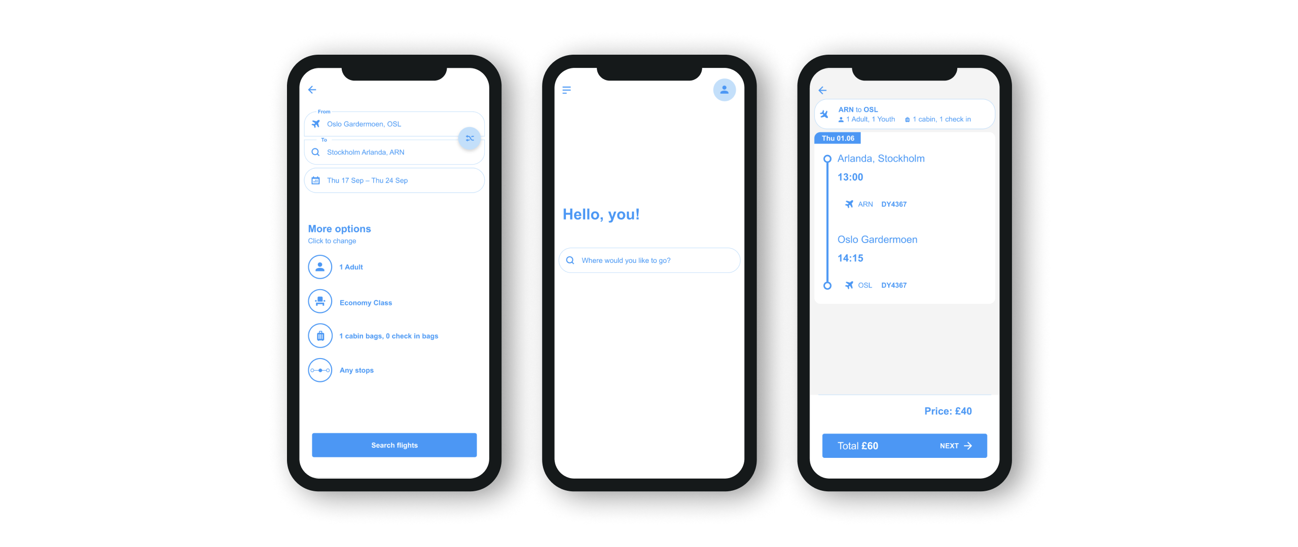
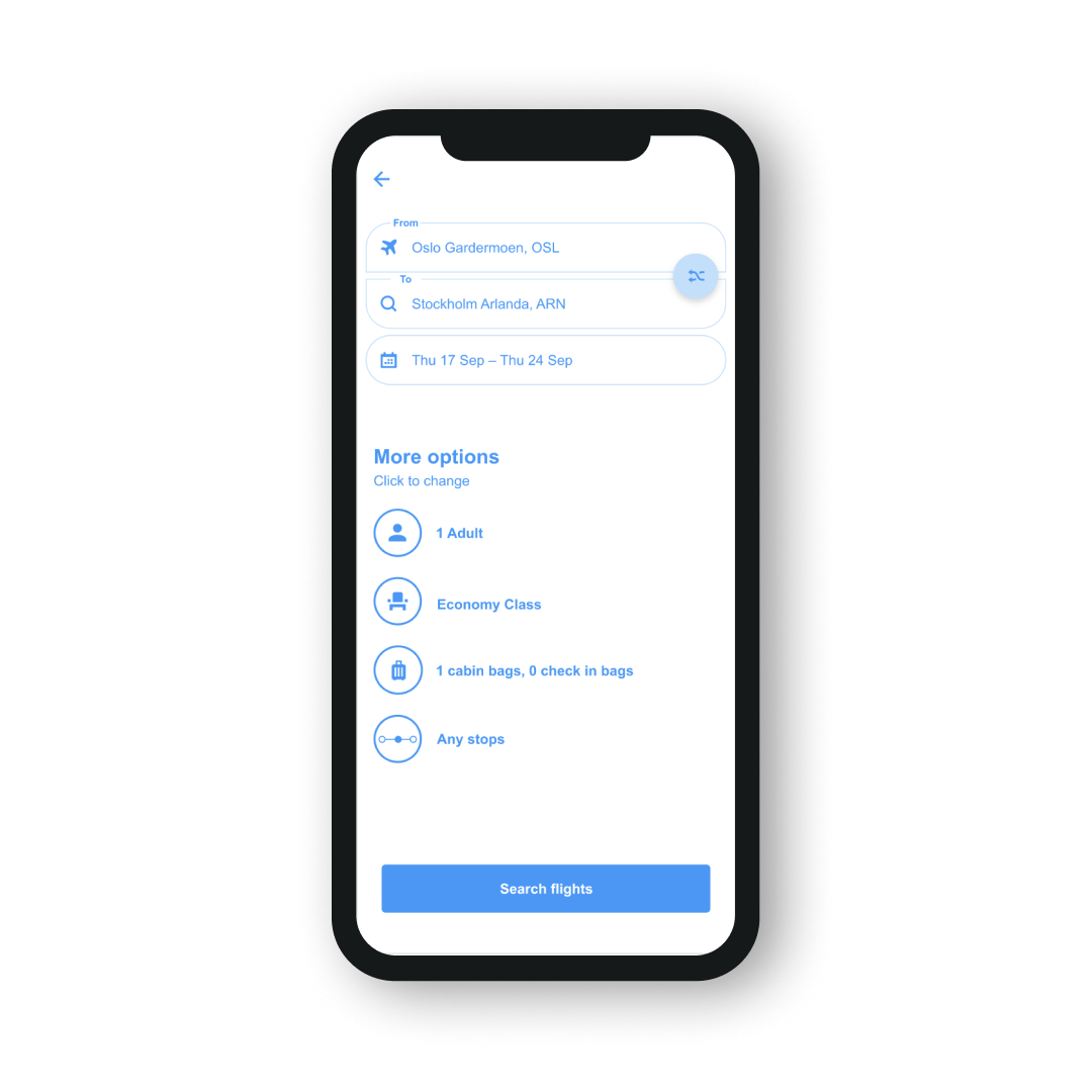
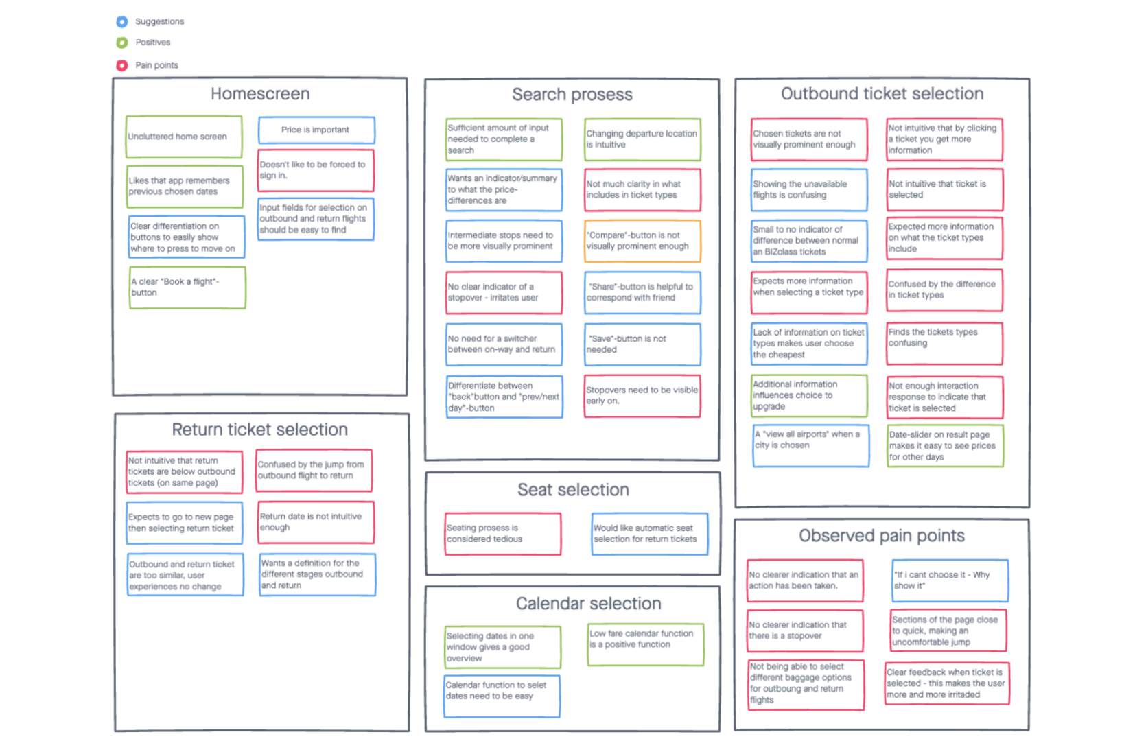
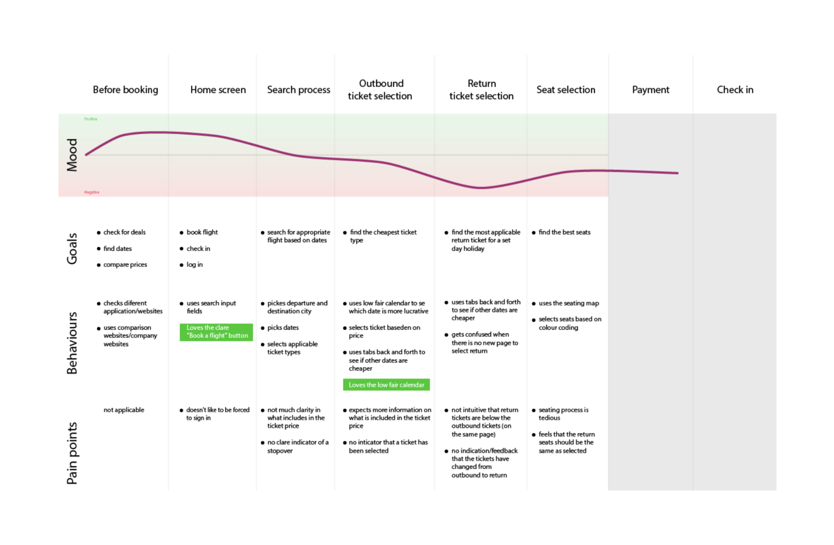
I then created a customer journey map, where I analyzed the participants' goals, behaviors, and emotions throughout their interactions with the airline applications. This mapping process involved outlining the key stages of the user journey, from initial awareness to booking a flight.

By identifying each participant's goals, I noted what they aimed to achieve at each step, while their behaviors provided insights into how they navigated the application. Capturing their moods helped to highlight the emotional highs and lows experienced during the process.

This comprehensive analysis enabled me to pinpoint critical touchpoints that influenced user satisfaction and identify opportunities for enhancement, ultimately informing design decisions that would create a more seamless and enjoyable user experience.

User flow

With the insights from the usability tests and the customer journey map, I was ready to create the user flow for my application. This flow outlines how users will navigate through the app, detailing the rules for interactions and the default states of each screen.

I focused on ensuring a consistent user experience by specifying how users transition between screens and what actions trigger responses. This user flow serves as a guide for creating an intuitive and user-friendly interface, facilitating seamless navigation and informing the design and development phases.

Wireframing

Next, I combined all the insights and user flows into a low-fidelity wireframe, which serves as a visual blueprint for the application. This wireframe outlines the essential layout and functionality, focusing on key components such as navigation menus, buttons, and content areas to ensure a logical user flow.

By prioritizing functionality over aesthetics, I was able to concentrate on enhancing the user experience. The low-fidelity wireframe also facilitated early-stage feedback from stakeholders and team members, allowing for quick iterations and adjustments before progressing to high-fidelity designs and prototyping.

If you want to see the full project please contact me

Email mail LinkedIn open_in_new